Creative Coding Utrecht
Website redesign for smoother navigation and playful interaction
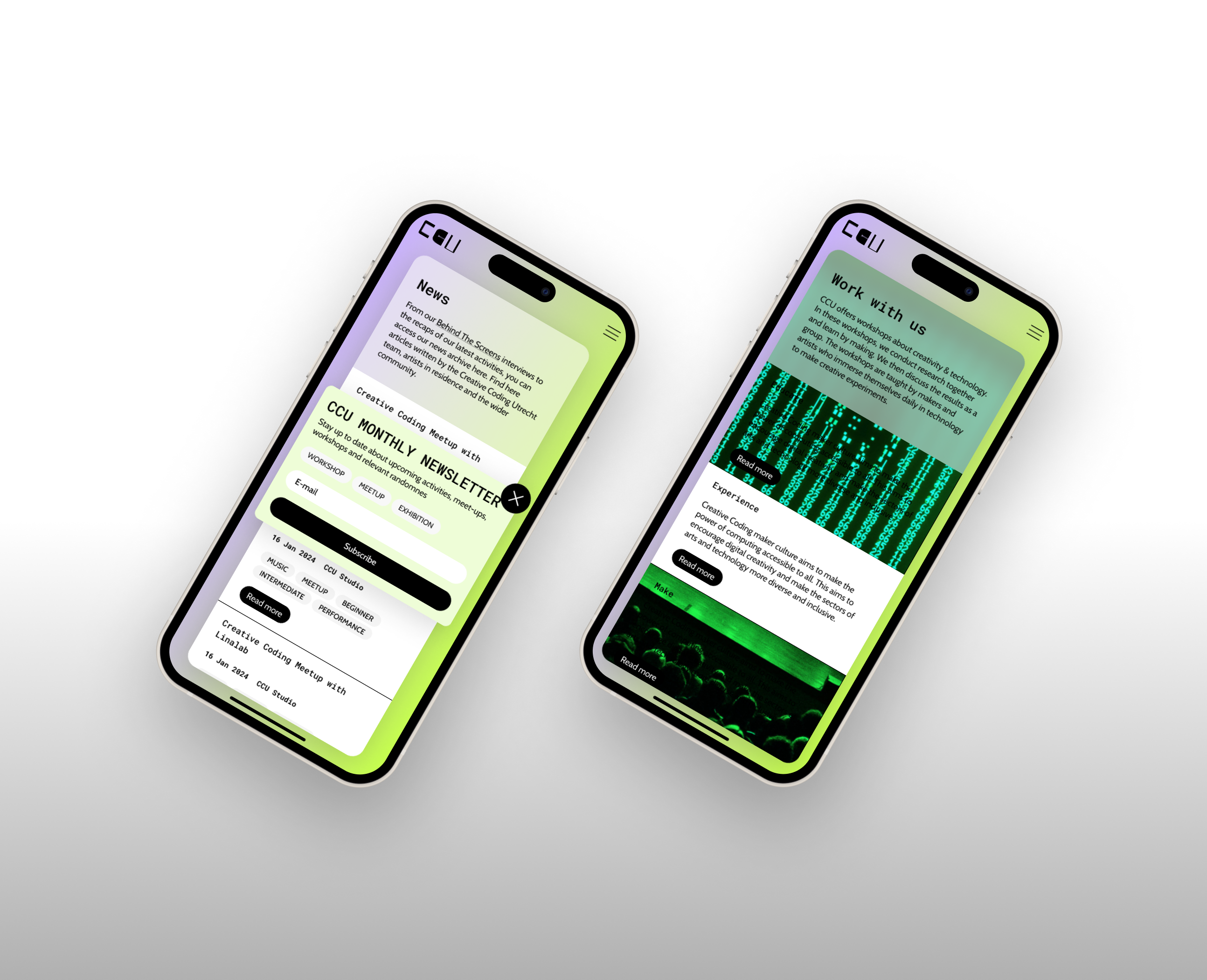
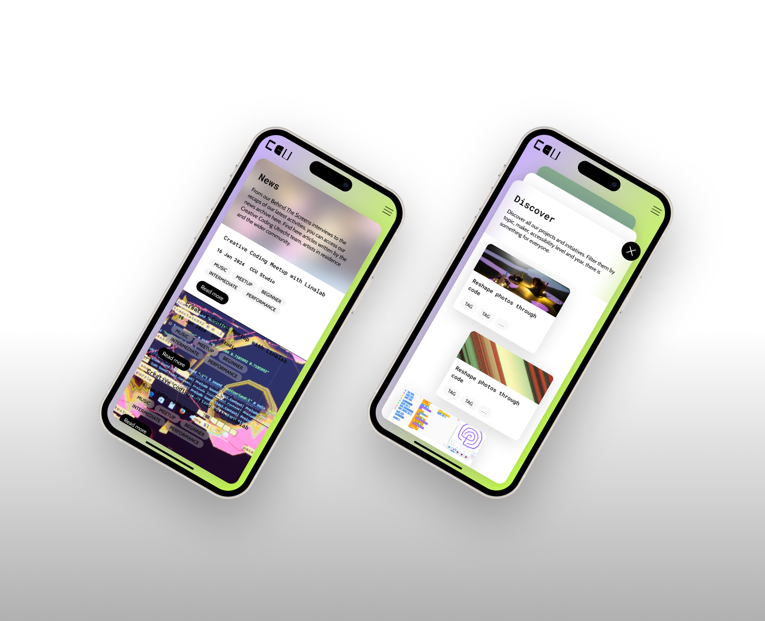
Creative coders shouldn't have to be creative just to find what they need. The website expansion for Creative Coding Utrecht, a non-profit organization fostering community and learning around creative coding, aims to streamline navigation and simplify information architecture by establishing four core pillars of the organisation and a Discover page. This allows users to easily explore CCU’s projects, events, and services. Both the desktop and mobile versions of the website have been enhanced with new interactive features and playful visual elements, all cohesively tied together through a comprehensive design system.
Role
UX/UI design, design system, prototyping
Keywords
#creativewebdesign #uxdesign #uidesign #interactiondesign #designsystems #figma
Process
#wireframing #informationarchitecture #conceptdevelopement #components #prototyping #testing
Collab
@frosnapers
Creative Coding Utrecht
Issue
The website’s navigation and information architecture no longer effectively represented the organization's activities and offerings. While the organization expanded, its content outgrew the last design created by Frosnapers in 2019, necessitating restructuring. The website on mobile phones was facing some issues in showcasing the content and did not follow the playful interactions, the desktop version is engaging its users with.
Idea
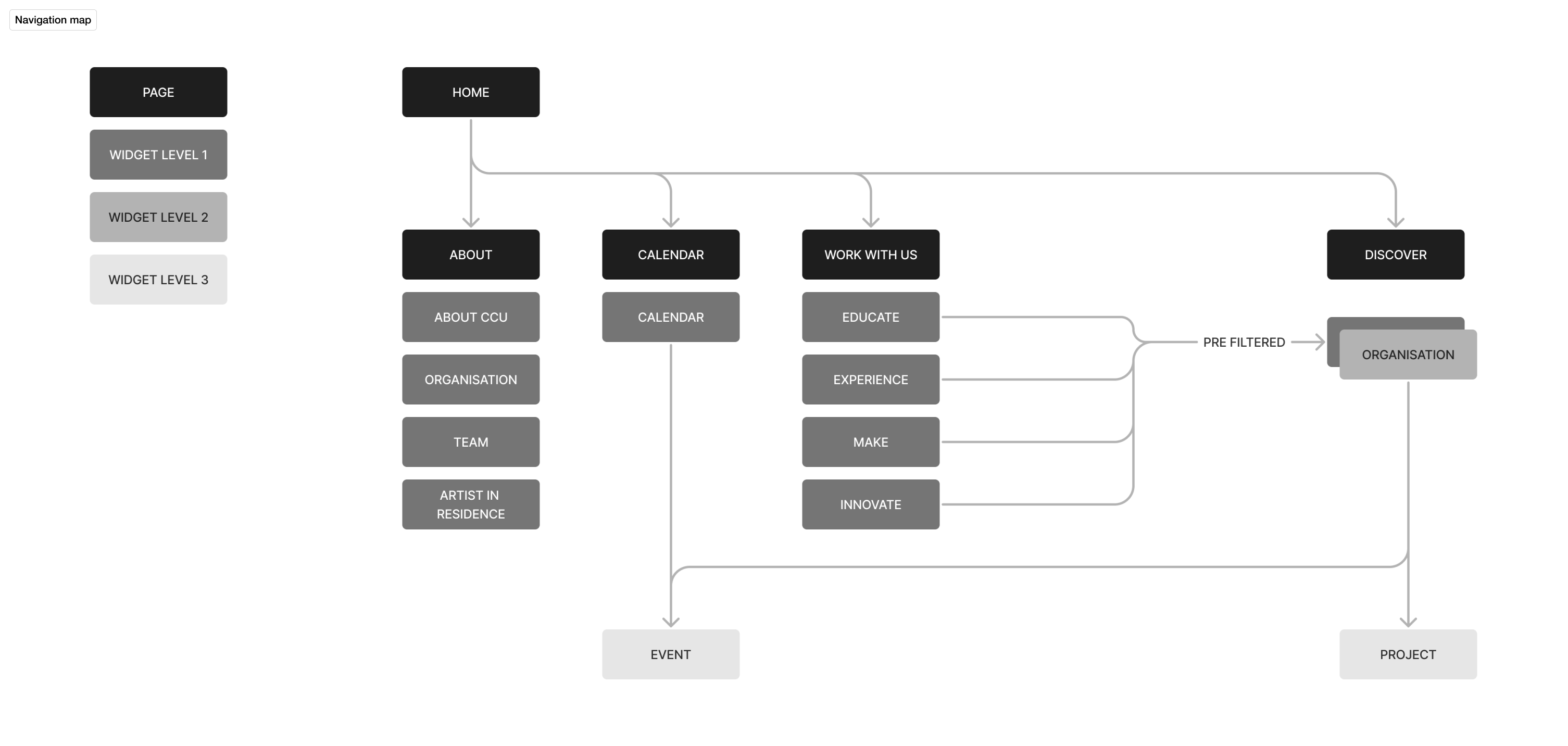
The focus lies on establishing a simpler information architecture with a clear overview of the CCU’s events and services and implementing new interactive features that align on the desktop and mobile versions. Our approach aims to capture the attention of the creative coding community by inviting them to an interactive playground where playing, learning, and connecting go hand in hand. Key features include:
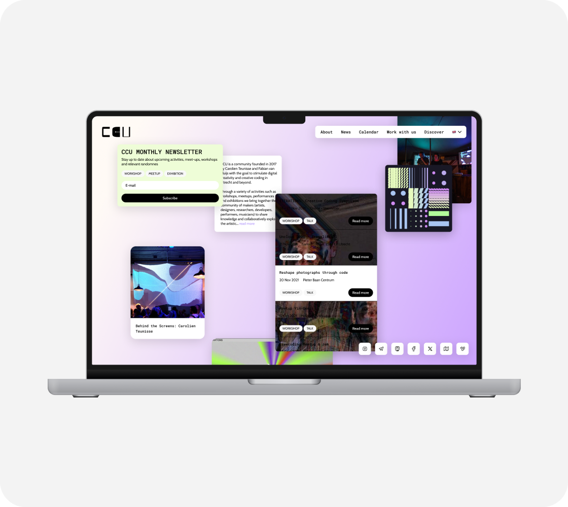
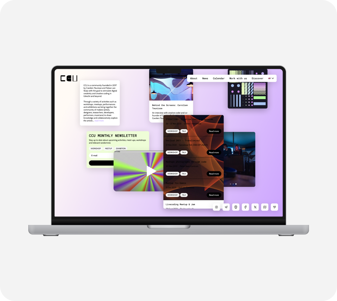
Playful interaction ◡ Replaceable widgets and stacking tabs ensure engagement for users throughout the website both on desktop and mobile phones.
Smooth navigation ◡ The establishment of the 4 core pillars of CCU’s activities: Educate, Experience, Make and Innovate, secure a simplified navigation and provide a better overview of the growing content of CCU.
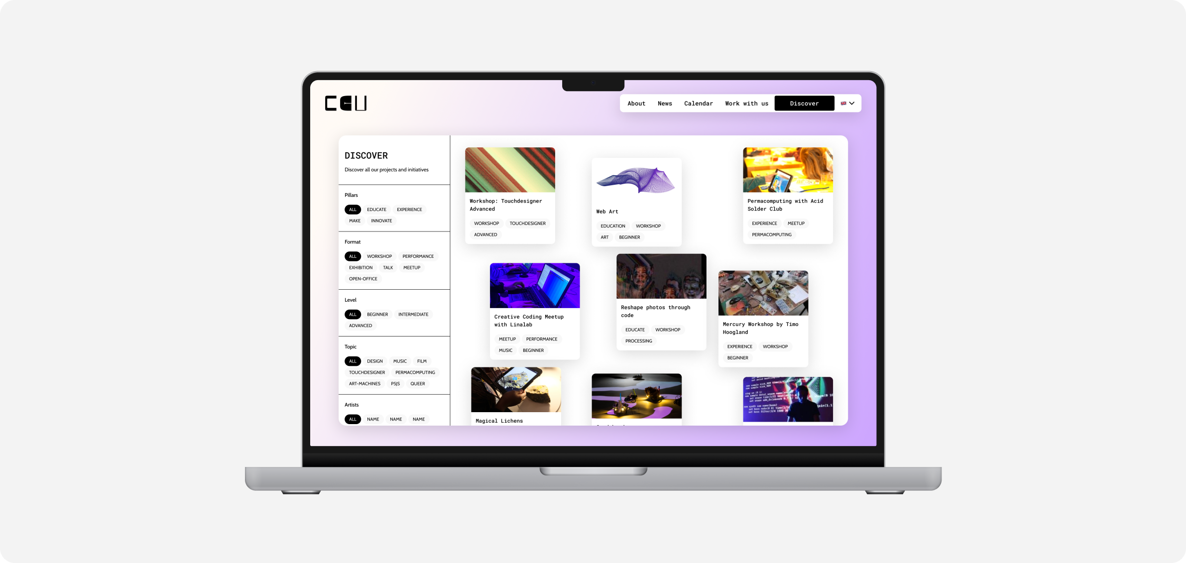
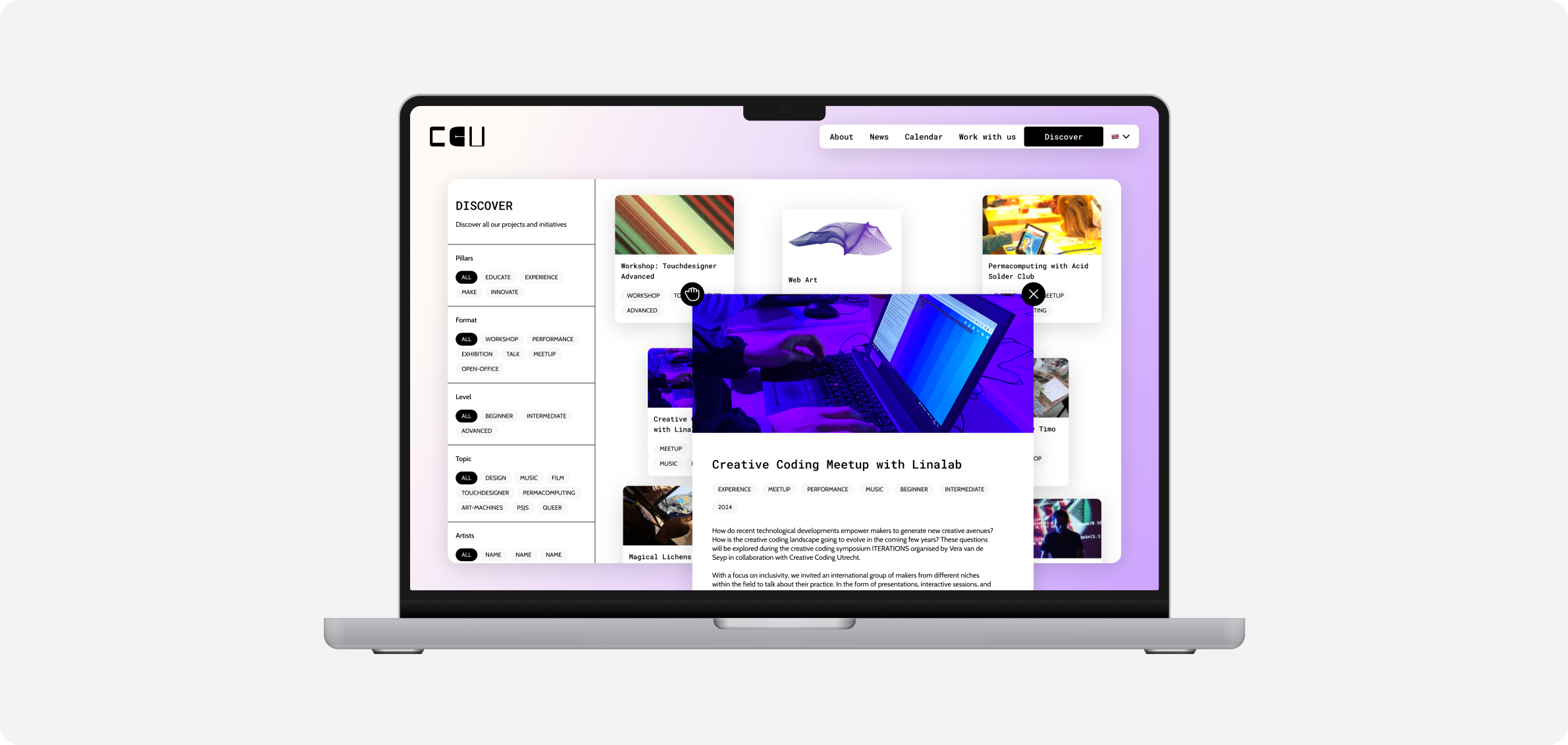
Discovering projects ◡ Meta filtering page, 'Discover' functions as a melting pot for CCU's projects, workshops, events and services. Through the filters, users can easily find what they are looking for or explore the different formats CCU works in.





Inquire
Our process involves close collaboration with the Creative Coding Utrecht team to understand their goals, target audience, and desired user experience. Iterations of the design were made based on their feedback and insights from the web developer about the constraints of creative code. Additionally, we explored innovative design techniques and technologies, such as incorporating randomized placement for project thumbnails, to create an interactive user experience that aligns with the organization's brand and objectives and reflects its playful spirit.
Introspection
This project has shown me how unconventional solutions can create a fresh and engaging design while remaining consistent and predictable through an established design system. CCU let me have a sneak peek into the world of code that can be fun and beautiful. I gained inspiration from exploring artists and creators using creative coding to break down limits and shape art, music, performance and possibly the future of our culture.

Creative Coding Utrecht
Website redesign for smoother navigation and playful interaction
Role
UX/UI design, design system, prototyping
Keywords
#creativewebdesign #uxdesign #uidesign #interactiondesign #designsystems #figma
Process
#wireframing #informationarchitecture #conceptdevelopement #components #prototyping #testing
Collab
@frosnapers
Creative Coding Utrecht
Creative coders shouldn't have to be creative just to find what they need. The website expansion for Creative Coding Utrecht, a non-profit organization fostering community and learning around creative coding, aims to streamline navigation and simplify information architecture by establishing four core pillars of the organisation and a Discover page. This allows users to easily explore CCU’s projects, events, and services. Both the desktop and mobile versions of the website have been enhanced with new interactive features and playful visual elements, all cohesively tied together through a comprehensive design system.
Issue
The website’s navigation and information architecture no longer effectively represented the organization's activities and offerings. While the organization expanded, its content outgrew the last design created by Frosnapers in 2019, necessitating restructuring. The website on mobile phones was facing some issues in showcasing the content and did not follow the playful interactions, the desktop version is engaging its users with.

Idea
The focus lies on establishing a simpler information architecture with a clear overview of the CCU’s events and services and implementing new interactive features that align on the desktop and mobile versions. Our approach aims to capture the attention of the creative coding community by inviting them to an interactive playground where playing, learning, and connecting go hand in hand. Key features include:
Playful interaction ◡ Replaceable widgets and stacking tabs ensure engagement for users throughout the website both on desktop and mobile phones.
Smooth navigation ◡ The establishment of the 4 core pillars of CCU’s activities: Educate, Experience, Make and Innovate, secure a simplified navigation and provide a better overview of the growing content of CCU.
Discovering projects ◡ Meta filtering page, 'Discover' functions as a melting pot for CCU's projects, workshops, events and services. Through the filters, users can easily find what they are looking for or explore the different formats CCU works in.


Inquire
Our process involves close collaboration with the Creative Coding Utrecht team to understand their goals, target audience, and desired user experience. Iterations of the design were made based on their feedback and insights from the web developer about the constraints of creative code. Additionally, we explored innovative design techniques and technologies, such as incorporating randomized placement for project thumbnails, to create an interactive user experience that aligns with the organization's brand and objectives and reflects its playful spirit.


Introspection
This project has shown me how unconventional solutions can create a fresh and engaging design while remaining consistent and predictable through an established design system. CCU let me have a sneak peek into the world of code that can be fun and beautiful. I gained inspiration from exploring artists and creators using creative coding to break down limits and shape art, music, performance and possibly the future of our culture.
